Ever since working on Body Blogger, a project I developed involving the year long data collection and live streaming of my own heartbeat rate, I’ve had an interest in the visualisation of physiological data. Over the years I’ve experimented with an assortment of different methods of visualising physiological data and one of the most fun experiences I’ve had is in the visualisation of group activity: from visualising the experience of a couple of people visiting the theater to a group of people walking about the streets of Liverpool.
Recently I consulted on the Rhythmanalysis project which involved the collection of physiological data of 10 people from 2 different workplaces in the Liverpool area: Minsky’s hairdressers and the game testing lab at Sony Computer Entertainment. This data was to be used for design an art exhibit which was recently shown at FACT Liverpool. The project was interested in visualising the physiological rhythms of different work environments in order for the public to be able to compare and contrast them.
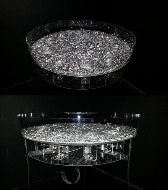
Designed by Vernoica Ranner, the current installation, which is a work in progress, visualises heart activity as a rotating disc filled with marbles. The more active the heart the faster the disc rotates. This interface allows the viewer to see physiological activity across the two workplaces at any moment in time but only that moment.
I was kindly given permission by the project to re-use the data that was collected and over the weekend I spent a couple of hours experimenting with different interfaces, three of which I’ve included below.
The first visualisation (and my personal favourite), blends the design of the physical installation with the Body Blogger interface. It displays each workplace as a vertical row of 5 cells with each cell representing 1 employee from the respective workplace. The cell changes colour according to the employees heartbeat rate; colours are made to pulse out from the cell and blend with their surroundings in order to create a visualisation of the group’s physiological activity which can then be compared with the other workplace. This not only provides the viewer with an impression of the activity in the moment, but incorporates an element of the past as well gross activity of each group.
In the second visualisation, I focus more on the temporal aspects of the data set. Heartbeat rate is still represented according to different colours, but we can now see the employee’s heartbeat rate over both a short and long period of time (1 hr and 24 hrs respectively) which allows the viewer to get a sense of how time of day and daily activities effect the heart (e.g. in the late evening everyone has a lower heartbeat rate which one can assume is due to resting at home).
The third visualisation is a simulation of a physical art installation myself and Steve Fairclough developed which we proposed in the early days of the project. Along with using colours we would also use height to represent heartbeat rate showing both short and long term variations in heart activity. The second visualisation is an alternate version of this display.
These are only example visualisations, if I had more time I would of liked to of normalised the data set to be more representative of certain physiological activities. I did this for BodyBlogger (e.g. green represented a body at rest) after collecting a week’s worth of data so I could gauge roughly how my heart responded to common activities. In representing information this way it’s much easier for a wider audience to understand what is going on physiologically rather than dealing with absolute numbers. Given the difference in workplaces, one requiring employees to move around and the other requiring employees to sit down most of the day, it would of also been nice to incorporate motion into the visualisations to emphasize their differences.
[…] you’re interested in learning more about this work I highly suggest you visit Kiel’s website where he has additional videos of visualizations he’s been working on that use data collected […]